The problem/opportunity. The speed at which patients recover after knee replacement surgery varies greatly, and with physiotherapy and Health Care appointments often weeks apart, the activities carried out by the patient as part of their recovery can often be inadequate or incorrect.
The Solution. An app that works with wearable bluetooth sensors, that can monitor a patient’s progress and provide feedback to the Health Care team in real time. As well as providing valuable recovery data to the surgeon and physiotherapist, it also allows them to adjust the exercise and recovery regime that the patient follows, with exercise session guides, pain assessments and walking analysis tools.
Roles. I was the digital product designer, leading the UX and UI of the app. Ben Clarke was the lead UX designer for the whole product – including the wearable sensors, packaging and the health team facing web interface. George Foskett provided support UX & UI design. Development was by Method Park.

I created the design system with efficiency and consistency in mind. It had to work for both sections of the app (the patient section and the health care professional section), for both iOS and Android platforms and, as the app had a majority of elderly users, it also had a lot of accessibility features built in which all needed to be catered for in the design system.

I was responsible for defining the structure and architecture of the app so that both the patient and health care professional sections worked seamlessly with each other.

Designing an app that relies on an external physical device that the patient was required to maintain meant mapping out logic flows with every happy and unhappy path, communicating how to fix any issues and walking the user through the process in a manageable way.

Another challenge with this product was finding ways to communicate large amounts of highly technical information and instructions in a way that the typical user would be able to understand. I took a lot of inspiration from fitness tracking apps and looked at ways of gamifying the exercises to make them easy to follow and progress through. I opted for a clean, simple style of illustration that communicated the movements clearly but were also easy to animate.

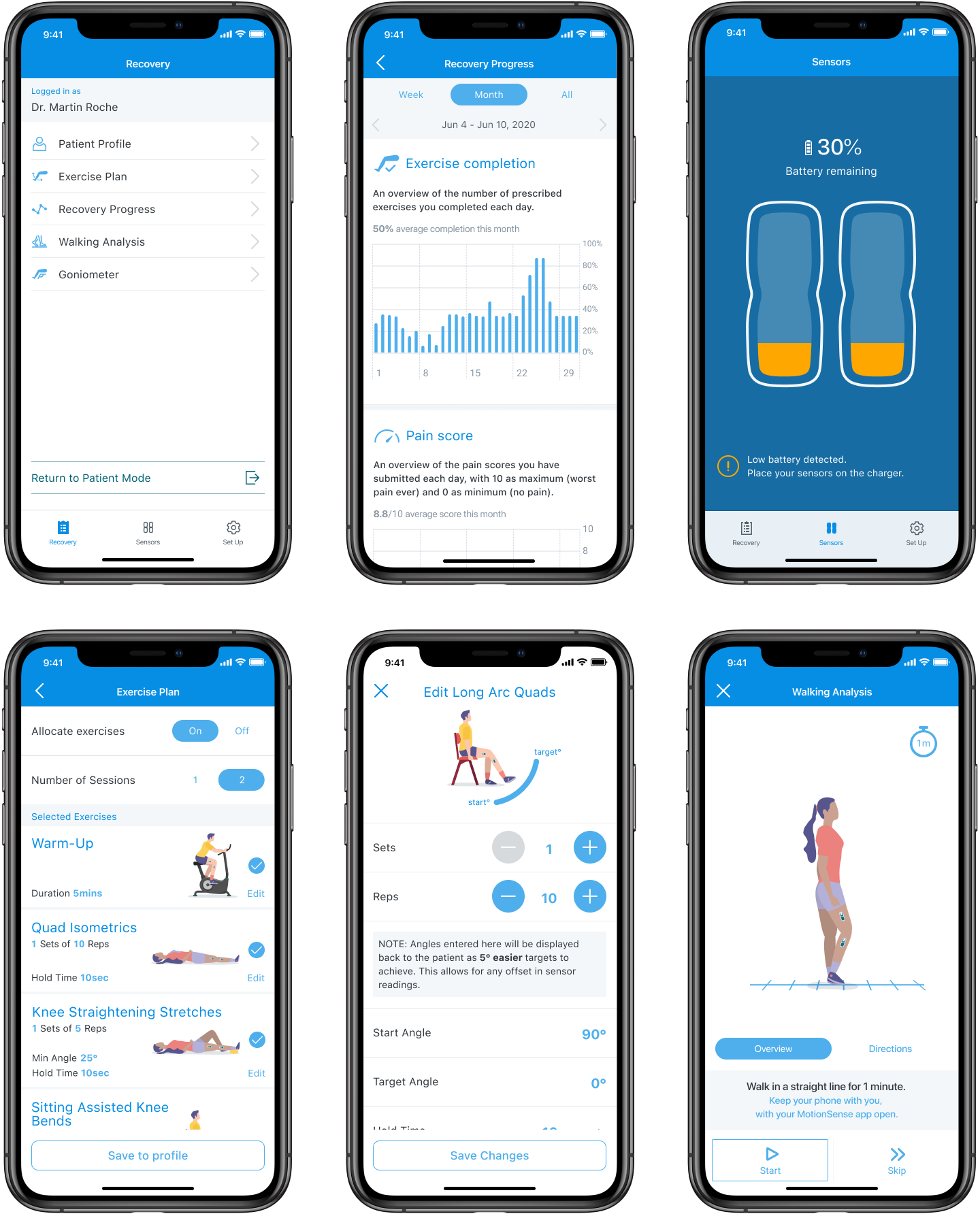
Fully customisable exercise sessions were required with step-by-step instructions and adjustable targets and goals. The UI provided an accurate real-time representation of the patients actual movements.

Promotional video –
Health Care Professional (HCP) Mode – as well as supporting the patient in their recovery, the app has a separate login for Health Care Professionals to monitor the patient’s recovery in more depth, customise their recovery programme and also help them with the more technical aspects of setting up the wearable sensors.
The HCP mode needed to feel like part of the same app, but have a distinct look and feel to differentiate it from the normal patient mode.

With the health care professionals being responsible for connecting and setting up the wearable sensors during a hospital visit, making this process as seamless as possible was imperative. This included creating user-flows for every part of the process that could go wrong, both with the technology and with the patient.
