The problem/opportunity. Canon asked for a full review and audit of their Irista service and app and make improvements to the user experience and the interface where we could.
The solution. The main place I felt the app was failing was in its ability to sort and search for specific images and moments.
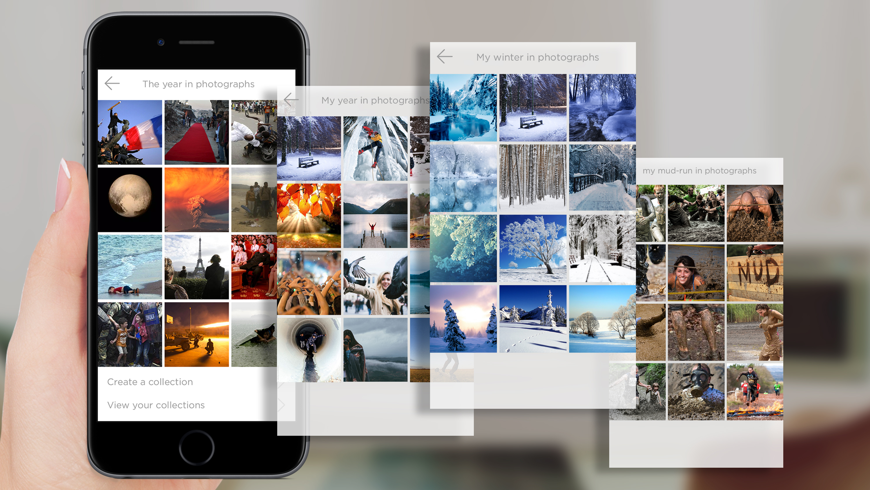
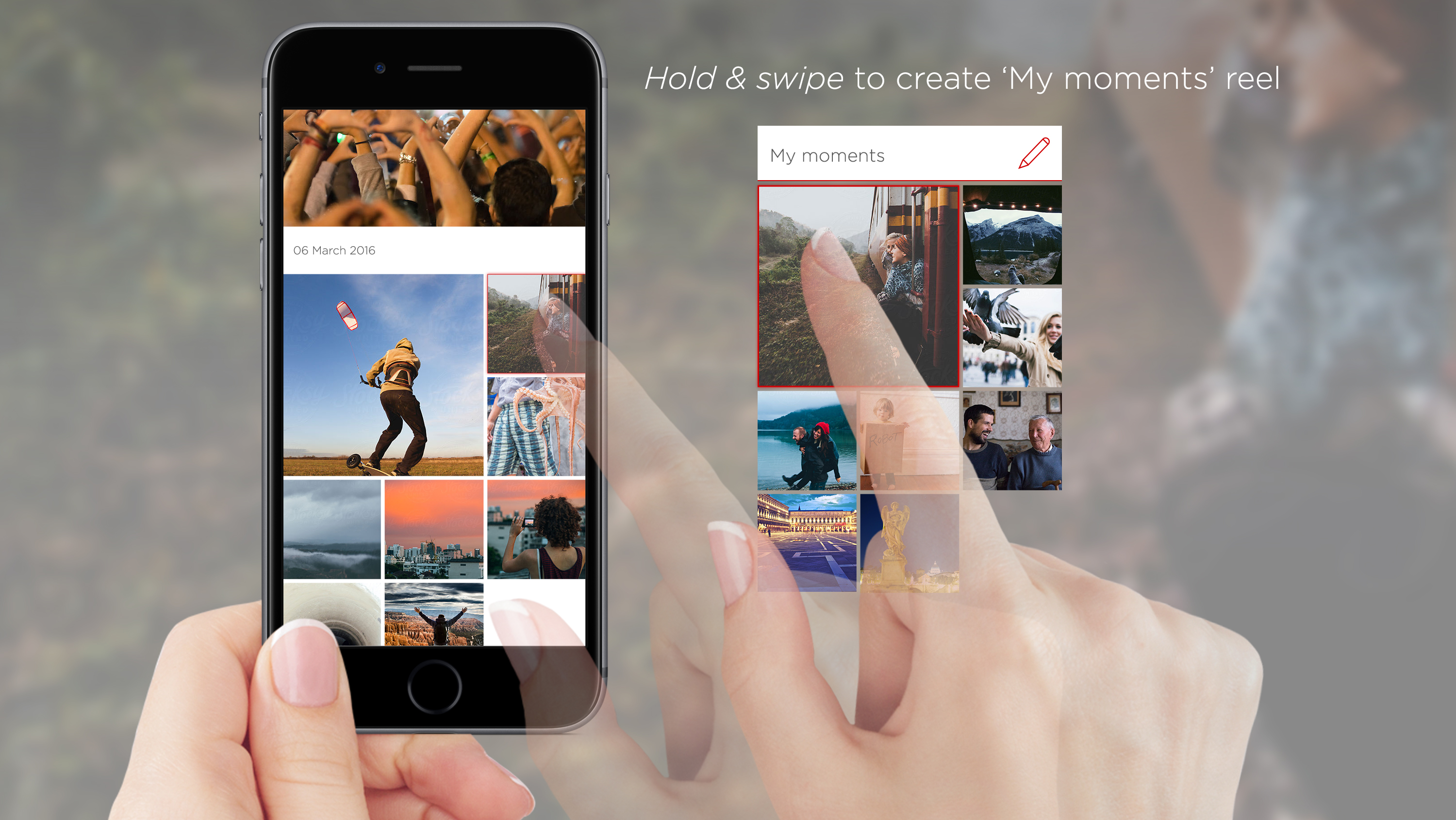
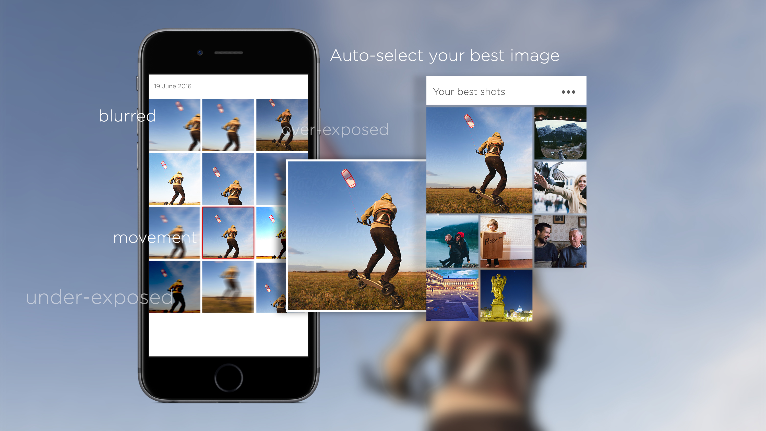
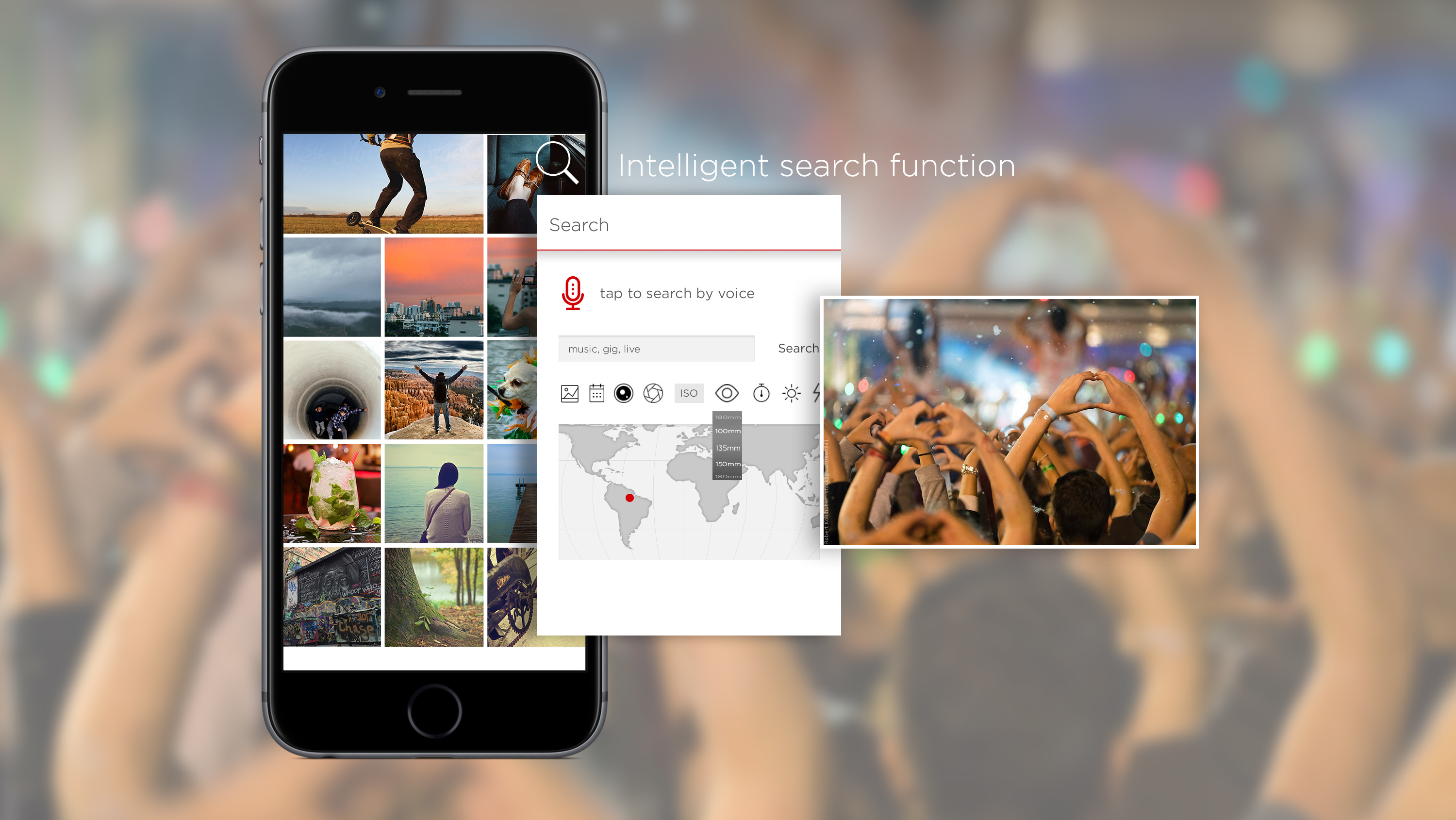
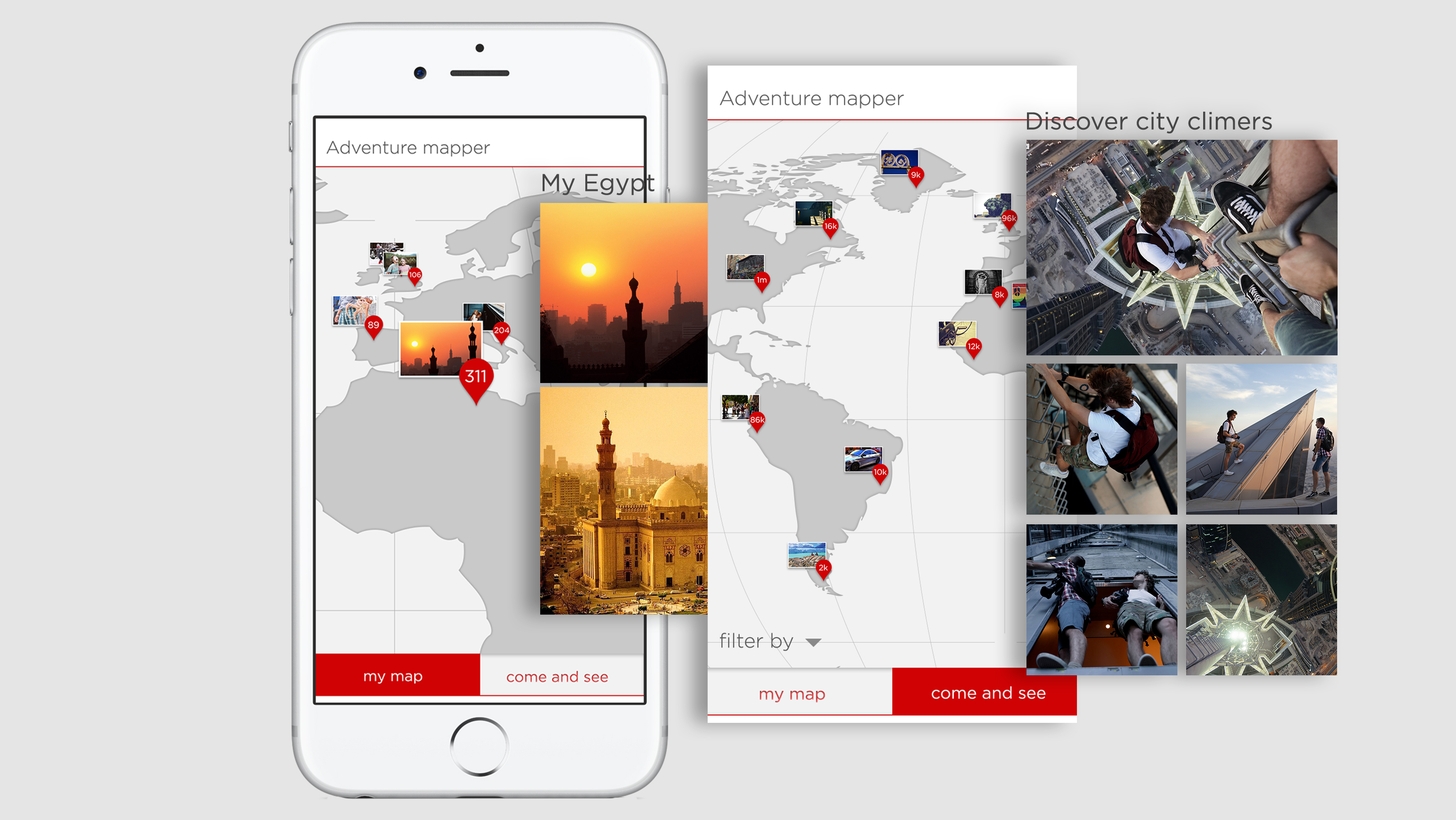
I designed a host of additional features, including ‘auto albums’ – buy date, colour, location, theme, etc; drag-and-drop function to create new custom albums; an ‘auto-select best image’ function where multiple versions of near-identical images are found; intelligent auto-tagging and quick search functions – including audio search functions; auto-image-correct suggestions; and a social network element, allowing users to follow and join photography groups with similar interests. I created a new UI that remained on-brand for Canon and Irista but was more intuitive to use as it was less cluttered and had clearer navigation and iconography.
Roles. I was the lead UX and UI designer. The team consisted of me, a UX researcher, a product manager and a tech lead for technical insight and support.
